Selector
The Selector component makes it easy to switch between a number of configured values to send to a downstream component. Configure a group of control buttons and assign a value or text string to send when a button is pushed on. One button from the group can be active at a time.
- Drag the Selector component into your schematic.
- Select the component to configure how many selection controls you want. See Properties.
- Connect the Selector component's Value control pin to the input control pin of another component.
- Press F5 to save your design to the Core and run it. (Or, press F6 to emulate your design.)
- Configure the Label and Value for each selection (Sel) button. See Controls.
- Click a selection button (or, use the Selection combo box to select an assigned Label) to enable the selected control and send its assigned value to the connected component.
|
Property |
Function |
Choices |
|---|---|---|
|
Selection Count |
Specify the number of control buttons. |
Default = 4 Range = 2 to 64 |
|
Control |
Function |
Default / Range |
|---|---|---|
|
Label |
Specify a text label for the Selection number. |
N/A |
|
Value |
Specify a text string to send to a connected component when the control button is enabled. Note: The Value you specify must be compatible with the downstream component's control pin. The output does not auto-convert the string. For example, if the downstream component is expecting an integer, you must first send the string though an integer control which can convert the string to an integer. |
N/A |
|
Sel |
Click a button to turn on a Selection. (Or, use the combo box to select an assigned Label.) |
Off / On |
|
Value (output text box) |
In Run or Emulate modes, shows the Value currently being sent. |
N/A |
|
Selection (combo box) |
In Run or Emulate modes, select an assigned Label to turn on a Selection. |
N/A |
|
Pin Name |
Value |
String |
Position |
Pins Available |
|---|---|---|---|---|
|
Value |
(text) |
Output |
||
|
Label n |
(user-defined) |
Input / Output |
||
|
Selector |
(text) |
Input / Output |
||
|
Selector n |
0 1 |
false true |
– |
Input / Output |
|
Value n |
(user-defined) |
Input / Output |
||
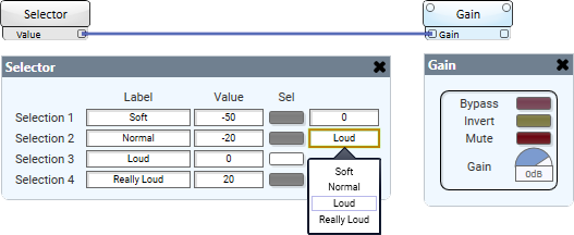
In this example, the Selector component is configured to set the gain value in the Gain component. The user can easily switch between the set gain values by either pressing a Selection button or selecting a label from the combo box.

