State Trigger
The State Trigger control type allows for triggering an action based on the status of a device. Read on to learn more.
Power Status
A UCI has a power button that goes high when the far end device is on and low when the device is off. When the UCI power button is clicked (triggered), the power state of the connected device should toggle. However, the button needs to know the current state of the device's power so that on toggle, the correct command is sent.
In the case of a device that supports on, off, and standby modes, the UCI power button would also need to reflect when the device is in standby and send the appropriate command when the button is pressed.
Position Feedback
For a UCI that controls motorized shades, or something similar that takes time to complete a motion, a State Trigger could send movement commands based on the current position of the device. For example, the button could rest in the off position (state 0). Once the command is ready to be sent (i.e., the position value is set), pushing the button would start the move. During the time that the device is moving, the button would indicate the motion state (state 1). Once the shade reaches the set position, the button would turn completely on (state 2) to indicate that the move has finished.
State Triggers are created within scripting components and appear as regular trigger buttons in control panels and UCIs.
-
In Text Controller and Block Controller, "State Trigger" is selectable as a button's Push Action. The button can then be dragged into the schematic or a UCI and modified with CSS (see Design Resources).
-
In UCI Controller, State Trigger is available from the Toolbox. The button can then be linked with other controls in the design like any other UCI control.
Users can click the button to trigger a command, just like regular triggers. However, State Triggers can have both input and output control pins. These controls have configurable Min and Max values to give flexibility with the number of states.
Triggering the Control
When a State Trigger control is triggered, an eventhandler within its script interprets what the trigger means and how to proceed (i.e., what calls to make) and whether the state value needs to change. State Triggers can be triggered by:
-
User interaction in the design or UCI
-
Using a trigger command on a State Trigger named control
-
Calling Trigger() on the State Trigger from its parent script (an eventhandler is not needed in this case)
-
Input via control wiring
Setting the State
The state of the control (its value) can only be changed from the State Trigger's home script – for example, within the script of a Text Controller containing the State Trigger control.
State Triggers only support integer values and report value, string, and position. Because only integers are supported, these behaviors occur when setting the value for a State Trigger:
-
Value set - the state is updated to the new integer-quantized value
-
String set (empty) - the state is not updated
-
String set (word or phrase) - the state is not updated
-
String set (integer number) - the state is updated to the integer equivalent of the string
-
Position set - the state is updated, quantized to integer values. For example, if a State Trigger has three states (0, 1, and 2) and the position is changed to 0.9, the value is updated to 2 and the position is quantized to 1.
Tip: Without CSS modification, a State Trigger will appear off if its state value is <= 50% of its range and on otherwise. On and off colors can be configured through the control's properties, as with other controls. The color of the button can also be modified through scripting using Color metadata.
Control Wiring Behavior
State Trigger control pins differ from other controls in that the input pin expects trigger input and the output pin provides either value or string data.
Note: A State Trigger's value cannot be changed via control wiring.
Input Pin
The input pin interprets incoming control changes as triggers as follows:
-
Text - if the incoming string is not empty
-
Value - if the incoming value is non-zero
-
Position - if the incoming position is greater than 0.5. (A position of precisely 0.5 does not cause the control to trigger)
-
Trigger - always triggers
Output Pin
The output pin provides:
-
Text - the current integer value of the state as a string – for example, "2".
-
Value - the state as an integer
-
Position - calculated based on the current value within the value range
In this example, a button configured as a State Trigger (called state_trigger) receives control data from an upstream Control Router and Custom Controls component. Depending on the upstream output selected, the State Trigger varies its output.
Schematic
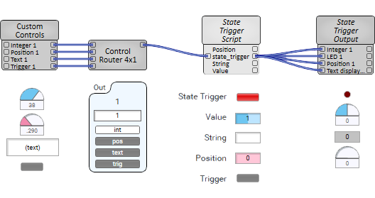
Control Panel
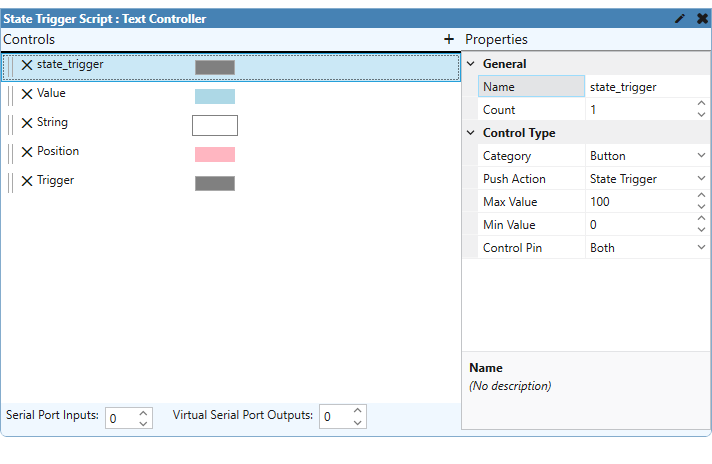
Script
state_trigger = Controls.state_trigger

colors = {
  "#F0F", "#E0E", "#D00", "#CC0", "#B0B", "#A0A", "#908",
  "#877", "#777", "#6A0", "#550", "#405", "#355", "#250", "#105"
}

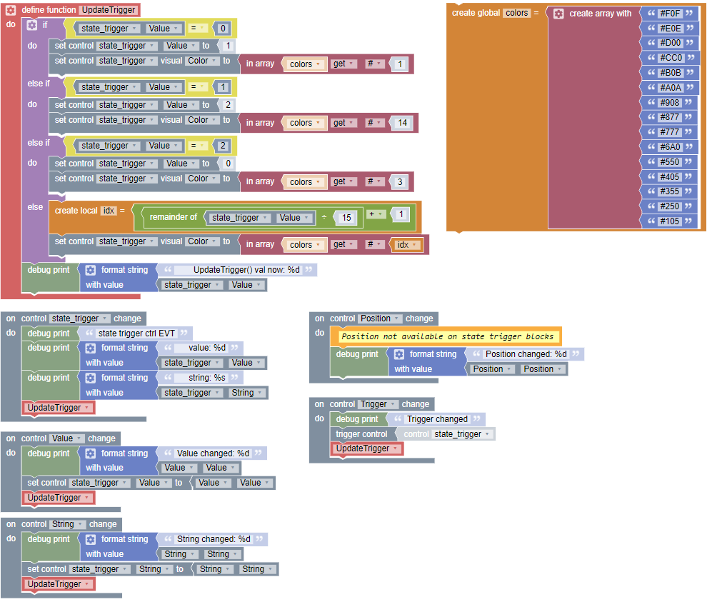
function UpdateTrigger()
  -- if state is 0, 1, or 2, you can get the colors to cycle
  -- else the color will change on each value, going through the whole array of values
  if state_trigger.Value == 0 then
    state_trigger.Value = 1
    state_trigger.Color = colors[1]
  elseif state_trigger.Value == 1 then
    state_trigger.Value = 2
    state_trigger.Color = colors[14]
  elseif state_trigger.Value == 2 then
    state_trigger.Value = 0
    state_trigger.Color = colors[3]
  else
    state_trigger.Color = colors[state_trigger.Value % 15 + 1]
  end

  print('   UpdateTrigger() val now: '..tostring(state_trigger.Value))
end

-- eventhandlers
state_trigger.EventHandler = function( changed )
  print("state_trigger control EVT")
  print("   value:  "..state_trigger.Value)
  print("   string: "..state_trigger.String)
  print("   pos:    "..state_trigger.Position)

  UpdateTrigger()
end

-- inline state_trigger
Controls.state_trigger.Value = 0

-- other controls to set state_trigger
Controls.String.EventHandler = function()
  print("String changed: "..Controls.String.String)
  state_trigger.String = Controls.String.String
  UpdateTrigger()
end

Controls.Value.EventHandler = function()
  print("Value changed: "..Controls.Value.Value)
  state_trigger.Value = Controls.Value.Value
  UpdateTrigger()
end

Controls.Position.EventHandler = function()
  print("Position changed: "..Controls.Position.Position)
  state_trigger.Position = Controls.Position.Position
  UpdateTrigger()
end

Controls.Trigger.EventHandler = function()
  print("Trigger changed")
  state_trigger:Trigger()
  UpdateTrigger()
endThis example shows the same concept as with the Text Controller example, but with Block Controller.
Schematic
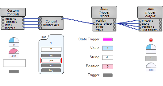
Control Panel
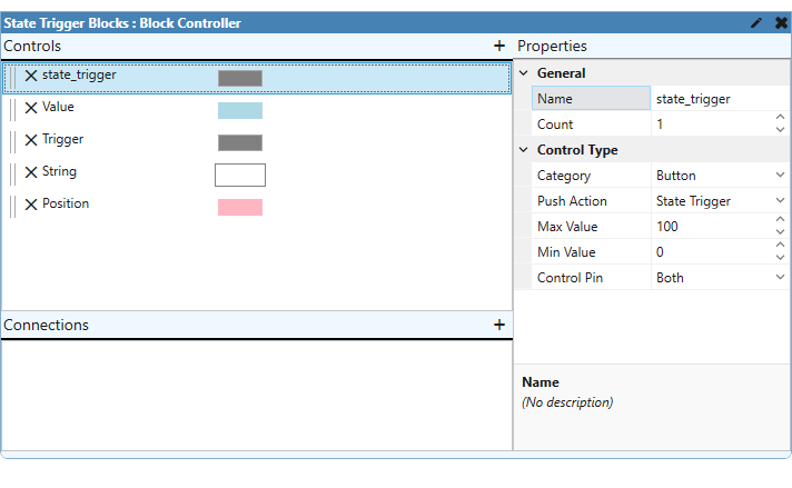
Blocks
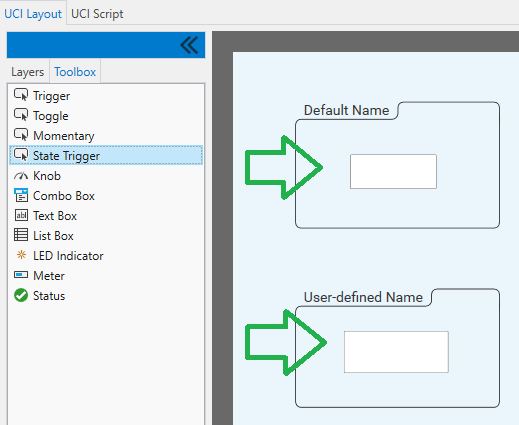
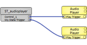
And in this example, two State Trigger controls have been dragged into a UCI from the Toolbox. One uses its default name (Control_1) and the other uses a user-defined name ("My Special State Trigger"). Each control has its output pin exposed (Control Pin property set to "Output") in the UCI Controller component for the associated UCI (called ST_audioplayer), which is each wired to an Audio Player component.
UCI Layout
Schematic
UCI Script
--Min and Max value of state trigger is 0 to 5
--so it should trigger the wired Audio Player once the value is >50% - i.e, above 3

--Default State Trigger Name
Controls['Control_1'].EventHandler = function()
  if Controls['Control_1'].Value == 0 then
    Controls['Control_1'].Value = (Controls['Control_1'].Value + 4)
    print('Value reached >50%, it triggers the audioplayer')
  end
end

--User Defined State Trigger Name
Controls['My Special State Trigger'].EventHandler = function()
  if Controls['My Special State Trigger'].Value == 0 then
    Controls['My Special State Trigger'].Value = (Controls['My Special State Trigger'].Value + 4)
    print('Value reached >50%, it triggers the audioplayer')
  end
end