UCI Controller
UCI Controller is a User Control Interface (UCI) design feature that is an alternative method of building UCIs. The traditional method involves copying controls from design components into a UCI, which thus ties that UCI to the design. UCI Controller, however, allows you to build a UCI from a list of template control types (Toggle, Knob, etc.), link one or more controls to components in the design, and then write a dedicated Lua script for the UCI. The UCI, and its script, can then be easily copied, re-used, and modified as desired.
- Select User Control Interfaces from the left-side pane.
- Click
 and select New User Control Interface.
 - Select the new UCI (for example, "Interface 1").
- In the right-side pane, under Properties, configure the UCI as desired. See UCI Controller .
- In the middle pane, select Page 1.
- In the right-side pane, under Properties, configure the UCI page, including its Title. See UCI Controller .
- Add control elements to the UCI page to build your UCI. See UCI Controller .
- To add more pages, see UCI Controller .
- To configure layering within a page, see Working with Layers.
Think of Layers as stacked, transparent sheets of glass on which you can create images. You can see through the transparent areas of a layer to the layers below. You can work on each layer independently, experimenting to create the effect you want.
Adding layers to your UCI allows you to separate items on your UCI page. When you create a page in the UCI, it will always have at least one layer by default.
You can add a layer to a single page, or create a shared layer that can be used across multiple pages.
- Select a page name.
- Click
 > Add Layer to add a layer to the selected page.
 - Add content to the layer – copy and paste or drag and drop items onto the selected layer.
You can create shared layers to easily share content between multiple pages. You add content to a shared layer the same as any other layer.
- Click
 > Add Shared Layer. The new shared layer is added at the Page level of the UI elements list.
 - Add content to the layer – copy and paste or drag and drop items onto the selected layer.
- In the UI elements list, drag the shared layer name under the desired page names.
- To view the layers within a UCI page, click the drop-down arrow next to the page name.
- Click
 or
or  to move a layer. Content on higher layers displays on top of the content on lower layers.
 - Click
 to delete the selected layers. You can delete a layer from the left pane regardless of its visibility or lock state.
- Click
 to hide or show a layer or an element within a layer. The
  icon indicates the layer or element is visible.
  Notes
Notes- When a layer is hidden you cannot select any content on that layer.
- You can delete the layer and the content on the layer is also deleted.
- Click
 to lock or unlock a layer or a layer element. The
  icon indicates the layer is locked.
 Notes
Notes- You cannot add, delete, or move any content on a locked layer.
- You can delete the layer when it is locked or unlocked.
- You can script actions of the layers. For more information, see Uci.
Link a UCI control to a component control in your design, and then easily re-link (or un-link) the control later if the UCI's use case changes. You can thus build an entire UCI and link its controls to components without ever having to wire anything in the design itself. There are two methods to link controls.
Using Link Icon
-
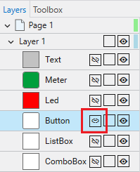
With your UCI selected, click the Layers tab.
-
For the control you wish to link, click the Link icon. For example, here is a UCI control configured as a toggle:
-
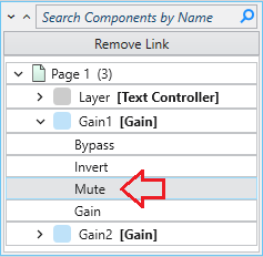
Select the component and control from that component to link to the UCI control. For example, here we have linked the toggle control to the Mute button of a Gain component:
Tip: If you later wish to link the UCI control to another component control, just click the Link icon again and select a different control for linking.
Using Drag and Drop
-
In the schematic window, click and hold the desired component control you wish to link.
-
Drag the control to the UCI tab/window.
-
While hovering over the button/shape in the UCI, press and hold Ctrl on the keyboard.
-
Release the mouse/trackpad while still holding Ctrl and a prompt will appear. Select from the following:
-
Link Control - Links the control to the current control design
-
Transfer Control Style - Links and overwrites with the original component control graphic
-
Tip: If you later wish to link the UCI control to another component control, just repeat the drag and drop process while selecting a different control for linking.
Adding Controls from the Toolbox
-
Select a UCI name from the User Control Interfaces section of the left-side pane.
-
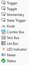
Click the Toolbox tab. You'll see a list of control types:
-
Drag a control type into the UCI Layout Tab.
-
In the right-side Properties pane, assign a unique Control Name that can optionally be referenced in a UCI Script.
-
Configure the rest of the control's properties as you would with any other control.
-
Add more controls as desired.
Deleting Controls from the Toolbox
-
Select a UCI name from the User Control Interfaces section of the left-side pan.
-
Find the control that was dragged into the UCI Layout Tab.
-
Click on the control and press the delete key.
The Variables tab allows you to set certain Variables that you can later reference in your UCI Script. This feature allows you to modify the UCI script as changes are made to the Variables tab.
Note: UCI Variables can run .Value and .EventHandler.
Tip: You must be in Emulate mode or Running the design on a Core for the feature to be interactive.
- Select a UCI name from the User Control Interfaces section of the left-side pane.
- Select the Variables Tab.
- Click
 to add a Variable to the selected page.
 - Choose what type of Variable you wish to use. You can select String, Number, Boolean, Color.
- String: Insert your text field.
- Number: Insert any number. You can use the up / down arrows to select a number, or manually type in a number.
- Boolean: Check-box field to allow for a Boolean.
- Color: Pops up with the Color Picker box to choose a color.
- Select a UCI name from the User Control Interfaces section of the left-side pane.
- Select the Variables Tab.
- Choose what type of Variable you wish to update.
- Make the necessary changes, (i.e., changing the color, or updating the string, etc.).
Note: You must click away from the Variable that you updated in order for the changes to take effect. For instance, if you have a Variable Name as "Room123", and change it to "Room456", you must click out of the Variable box in which you typed. Enter/Return keys do not force the change.
- Select a UCI name from the User Control Interfaces section of the left-side pane.
- Select the Variables Tab.
- Click
 to delete the selected Variables.
Visit the Import and Export UCI Variables topic to learn how to import and export UCI Variables.
Using UCI Variables with CSS Integration makes customizing a UCI even easier by pulling in predefined colors, icons, etc. from a CSS Style (to learn more about CSS Styles, see the UCI Styles topic).
Note: Examples 1 and 2 are best when you already have the source classes defined in your style sheet. Example 3 is best when you need to assign icons using source Variables.
Tip: When using a UCI variable to override CSS Content, add quotes around the text if it contains spaces or other special character.
In the following video, the root style.css file contains root background, primary, secondary colors, and button radius size.
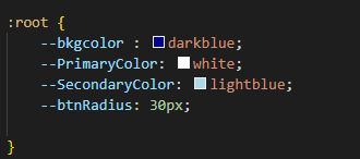
After choosing the Style sheet, those root preferences automatically import. However, we can easily change that information.
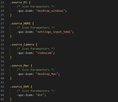
The root file also contains predefined button icons for Mac, DVR, and PC.
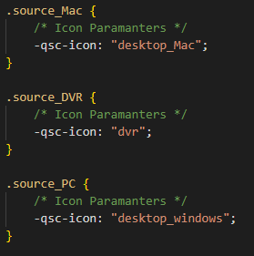
Using this predefined information, the example below quickly and effortlessly imports the same icons once the variable name matches.
The EventHandler on the UCI Script assigns the specific button to what the Variable Value is set to.
The CSS Style sheet contains source_Variable to easily assign icons.
![]()
With the source_Variable defined, another portion of the UCI script details what icon will be placed into that variable.
The UCI Script tab contains a familiar interface for authoring Lua code specific to the selected UCI. This makes it easy to duplicate a UCI and update the new one (i.e., modify the script) with different parameters. One use case, for example, is having multiple UCIs with differing Layer and Shared Layer visibility settings.
Note: A Q-SYS Scripting Engine feature license is not required for building and running scripts contained within the UCI Script tab. Some Lua methods are not supported – see Unsupported Lua methods for details.
Note: When referencing the Uci Lua methods in your UCI script, it will not work if you define the UCI_Name variable because the script is local to the UCI and its name.
Examples
Here is a simple UCI script that sets layer visibility.
timer0 = Timer.New()


timer0.EventHandler = function()
  Uci.SetLayerVisibility('Page 1', 'Layer 1', false, 'fade')
  Timer.CallAfter(function()
      Uci.SetLayerVisibility('Page 1', 'Layer 1', true, 'fade')
    Uci.SetLayerVisibility('Page 1', 'Layer 2', false, 'left')

    Timer.CallAfter(function()
        Uci.SetLayerVisibility('Page 1', 'Layer 2', true, 'left')
    Uci.SetLayerVisibility('Page 1', 'Layer 3', false, 'right')

      Timer.CallAfter(function()
          Uci.SetLayerVisibility('Page 1', 'Layer 3', true, 'right')
    Uci.SetLayerVisibility('Page 1', 'Layer 4', false, 'top')

        Timer.CallAfter(function()
            Uci.SetLayerVisibility('Page 1', 'Layer 4', true, 'top')
    Uci.SetLayerVisibility('Page 1', 'Layer 5', false, 'bottom')

          Timer.CallAfter(function()
              Uci.SetLayerVisibility('Page 1', 'Layer 5', true, '')

          end,1)
        end,2)
      end,2)
    end,2)
  end,2)
end


timer0:Start(10)This line instructs the a Shared Layer in a UCI to become hidden with a fade transition.
Uci.SetSharedLayerVisibility('Shared Layer 1', false, 'fade')Unsupported Lua methods
Some Lua methods are not supported in UCI scripts, including methods from the following libraries. If you use these methods in the UCI Script tab, you will see this error in the Debug Output window: "This feature is unavailable in UCI Controller."
Note: These Lua methods are not supported in the UCI Scripts tab even if a Q-SYS Scripting Engine feature license is installed on the Q-SYS Core processor.
|
|
You can optionally expose control pins for each control that you have added to the UCI from the Toolbox, and then wire those control pins as you would with other components. Use the UCI Controller component to view and wire Toolbox control pins.
-
In your UCI, select a Toolbox control and configure the Control Pin property. You choose to expose Input, Output, Both, or no (None) control pins.

-
From the User Control Interfaces left-side menu, drag the UCI Controller component for your UCI into the schematic.
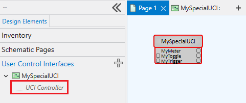
-
Wire the control pins as you would with other components.
Standard Control Pins
The UCI Controller component includes the same standard script control pins as other scripting components, selectable from the Control Pins section of the right-side pane.
|
Pin Name |
Value |
String |
Position |
Pins Available |
|---|---|---|---|---|
|
Code |
(text) Allows you to enter code. |
Input / Output |
||
|
Script Start |
(trigger) Starts the script running. |
Input / Output |
||
|
Script Status |
(text) Current status of the script. |
Output |
||
|
Script Stop |
(trigger) Stops the script. |
Input / Output |
||
Import and export UCIs to facilitate easy sharing between system designers. You can also download and import UCIs from Asset Manager.
Note: To learn more about import / exporting, please visit Import and Export UCIs.
