Flexbox
The Flexbox in the UCI toolbox is a layout tool that allows you to arrange items in a flexible and responsive manner. It is particularly useful for creating elements within a UCI that are assigned to a layer and are dynamically displayed based on changing factors like the number of sources or paired devices. Flexbox makes it easier to design a flexible layout structure without using float or positioning, by arranging items in rows or columns.
Note: At this time, popup buttons do not work with Flexboxes.
 Configuring Flexbox
- Select a UCI name from the User Control Interfaces section of the left-side pane.
- Click the Toolbox tab.
- Find Flexbox under Graphic Tools.
- Drag the control type into the UCI Layout Tab.
- Add as many other controls as needed.
- Go to the Layers tab, highlight all the controls you created by pressing Ctrl while clicking on each one.
- Drag all those into the Flexbox layer.
- Install the Style to the panel by choosing the Style in the UCI Properties.
- In CSS Class Name, choose the name of the StyleSheet.
- Configure the rest of the Flexbox's properties as needed.
Properties
Direction
Sets the direction in which the flex items are placed in the flex container. It can be set to Row (default) or Column. This determines whether the items are laid out horizontally or vertically.
Wrap
Controls whether the flex items should wrap onto multiple lines. It can be set to Off (default), or On. When set to On (Wrap), items will move to the next line if they exceed the container's width.
Justify Content
Aligns the flex items along the main axis (horizontal or vertical, depending on the direction). It can be set to Flex Start, Flex End, Center (default), Space Between, Space Around, or Space Evenly. This determines how the remaining space is distributed among the items.
Align Content
Aligns the flex lines within the flex container when there is extra space on the cross-axis. It can be set to Flex Start, Flex End, Center (default), Space Between, Space Around, or Space Evenly. This is useful when you have multiple lines of flex items.
Align Items
Aligns the flex items along the cross-axis (perpendicular to the main axis). It can be set to Flex Start, Flex End, Center (default). This determines how the items are aligned within their container.
Gap
Defines spacing in between items when ‘justify content’ is set to Flex Start, Flex End or Center.
Graphic Properties
Position
The coordinates reference a specific place in the schematic - for example,"100,100" (horizontal, vertical). 0,0 is the upper left corner of the schematic.
Size
Determines the overall dimensions of the control.
CSS Class Name
Assigns one or more CSS classes to a control element within the UCI. This property is used to apply custom styles defined in a CSS StyleSheet to the control, customizing its appearance and behavior.
Fill
Sets the fill color of the component in the schematic.
Corner Radius
Determines the roundness of the corners of a control. A higher value results in more rounded corners.
Margin
Sets the space outside the control, creating a buffer between the control and other elements.
Padding
Sets the space inside the control, creating a buffer between the control's content and its border.
Stroke Color
Sets the color of the border (stroke) around the control.
Stroke Width
Determines the thickness of the border around the control.
Examples
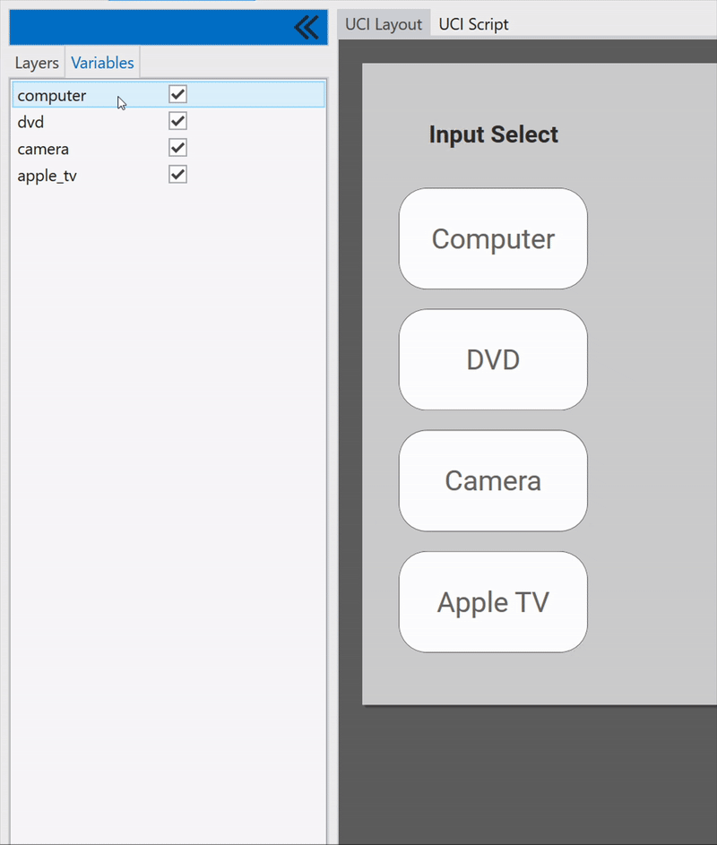
Flexbox with UCI Variables Example
In this example, a small UCI script translates the state of the created UCI Variables to the .IsInvisible metadata of the UCI Controls. All Controls are contained in a Flexbox so as they become invisible, the others re-position.
UCI Script Code
Uci.Variables.computer.EventHandler = function(ctrl)
  Controls.in_1.IsInvisible = not ctrl.Boolean
end

Uci.Variables.dvd.EventHandler = function(ctrl)
  Controls.in_2.IsInvisible = not ctrl.Boolean
end

Uci.Variables.camera.EventHandler = function(ctrl)
  Controls.in_3.IsInvisible = not ctrl.Boolean
end

Uci.Variables.apple_tv.EventHandler = function(ctrl)
  Controls.in_4.IsInvisible = not ctrl.Boolean
end
In this example, a CSS style sheet is being used to configure the properties of the Flexbox. The default flexbox{} class will automatically be applied to all Flexboxes on the UCI while the .flexbox-red{} class will be available to be assigned to a Flexbox.
flexbox {
  background-color: white;
  flex-direction: column;
  flex-wrap: wrap;
  justify-content: flex-end;
  align-items: flex-start;
  align-content: flex-start;
  gap: 0;
}

.flexbox-red {
  background-color: #de2828;
  flex-direction: row;
  flex-wrap: nowrap;
  justify-content: space-between;
  align-items: center;
  align-content: center;
  gap: 0;
}