UCI Style Controller
Use the UCI Style Controller to dynamically change the style of a selected User Control Interface (UCI) while a design is running on the Q-SYS Core processor. This makes it easy for a user to change the style on-the-fly – for example, to suit a room's lighting condition (selecting a "light" or "dark" themed style).
 Configuration Overview
UCI Style Controller automatically creates controls for each installed UCI in your design. Therefore, you must have at least one UCI style installed. To learn more about UCI styles and how to install them, see UCI Styles.
- Drag the UCI Style Controller component into your schematic.
- From the Properties pane, select the UCI to use with UCI Style Controller.
- Press F5 to save your design to the Core and run it.
- In your schematic, double-click the component to open its control panel.
- Select a UCI style to apply, or click <NONE> to turn off styling. See UCI Style Controller.
Tip: Drag the Style controls into the UCI to allow the user to change the style directly from the UCI.
Inputs and Outputs
Inputs and Outputs
Control components do not have traditional input and output pins. If a Control Pin is available for the component, an input or output will appear.
Control Pins represent the controls available in the component's Control Panel. Control Pins are used to link controls between Schematic Elements, and link to / from Control Scripts. Control Pin signal pins are represented by a  square, and the wiring is represented by a thick blue / white line.
Schematic Example
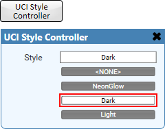
In this example, there are three UCI styles installed. Any of these controls (combo box selector or individual style buttons) can be dragged into the UCI to allow dynamic switching of the style, depending on user requirements. If no style is desired, the user can click <NONE>.
Properties
Tip: For additional properties that are not listed, refer to the Properties Panel help topic for more information.
UCI Style Controller Properties
UCI
Select the UCI to use with the UCI Style Controller.
Controls
Style (combo box)
The user can select the UCI style from a drop-down menu. The currently-selected style is indicated.
Style <NONE>
The user can click this button to turn off styling for the UCI.
Style name (button)
Each installed UCI style appears as a toggle button. The user can select a style by clicking its button.
Control Pins
|
Pin Name |
Value |
String |
Position |
Pins Available |
|---|---|---|---|---|
|
Style |
(text) |
Input / Output |
||
|
Style <NONE> |
0 1 |
false true |
– |
Input / Output |
|
Style name |
0 1 |
false true |
– |
Input / Output |